Mem - First Impressions
After trying Mem in earnest for the last few months I can safely say I’m more than a little intrigued. Here are some initial impressions of what’s working for me, and where I’d like to see Mem keep pushing the product forward.
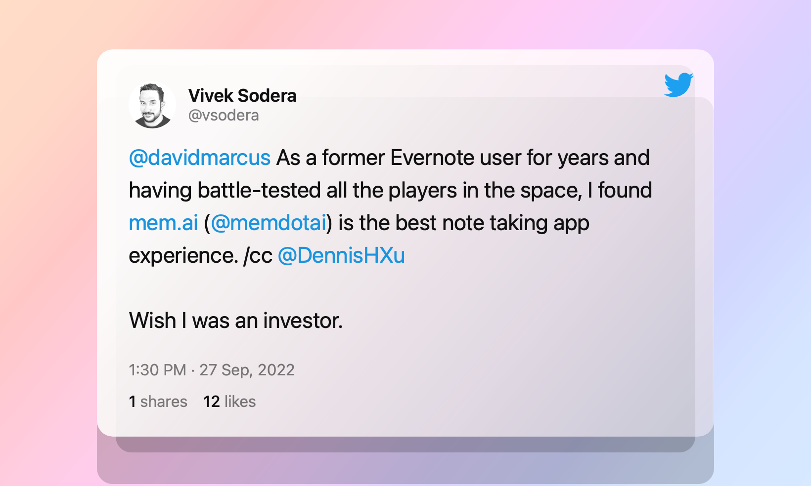
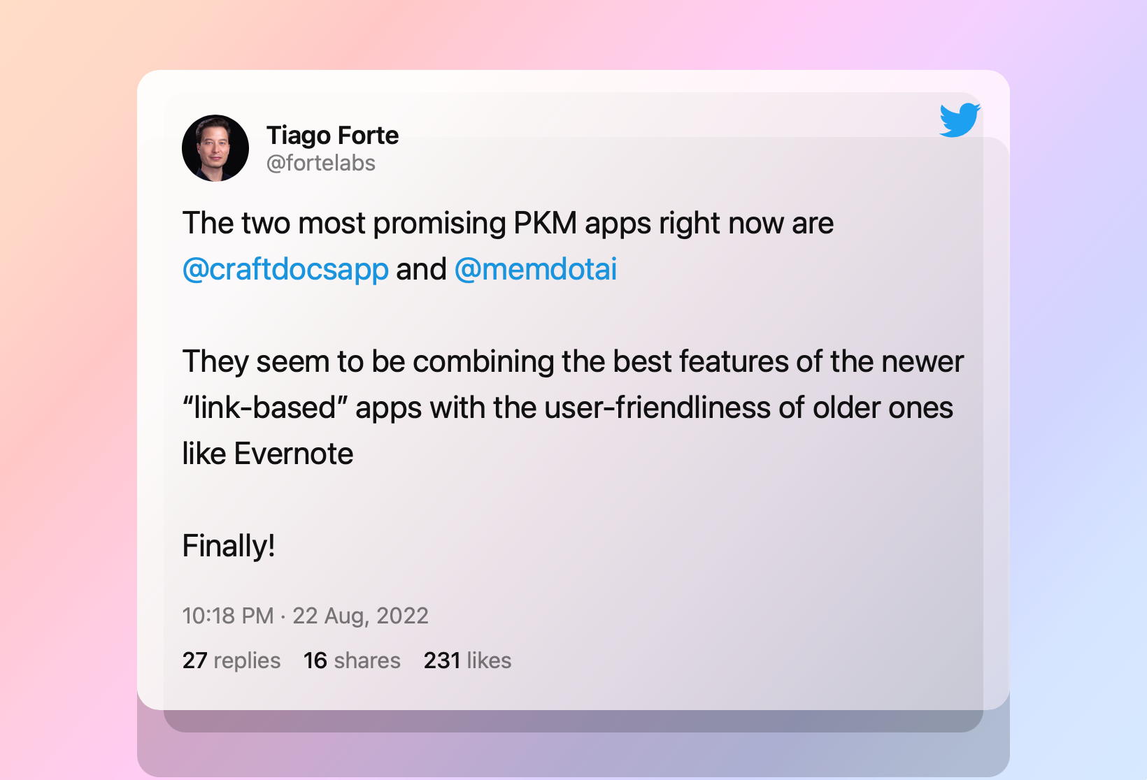
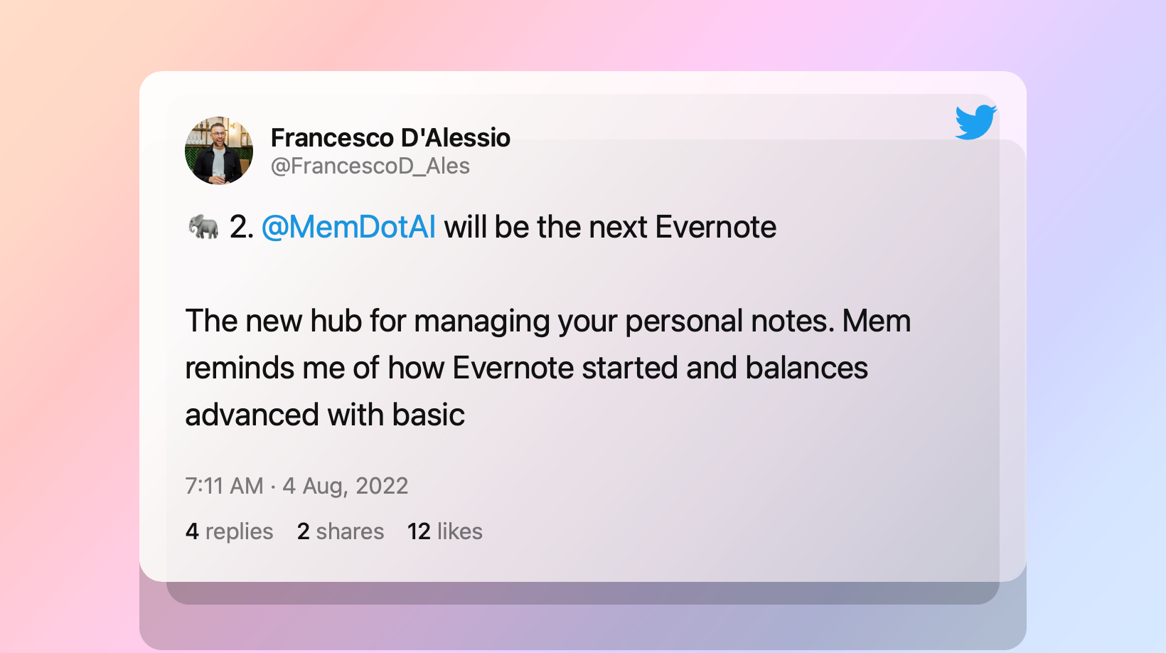
Recently, my Twitter feed has been full of praise for Mem, a new note taking app.*


After trying Mem in earnest for the last few months I can safely say I’m more than a little intrigued. Mem has some clever takes on notes - or where the future of notes could be headed. And I’m here for where Mem is skating with this puck.
Mem is largely still in beta, so I’m not ready to write a full review. Instead, below are some initial impressions of what’s working for me, and where I’d like to see Mem keep pushing the product forward.
What I’m Liking
- Designed for Teams Mem has made team collaboration a first-class citizen of its early feature set. While many popular PKMs (ugh), like Obsidian and Logseq are solidly single-player, Mem was designed for collaboration. As someone who wants to use a single app for both personal and team notes, this was the primary feature pushing me towards Mem.
- Elegant, Innovative and Simple UI The main interface in Mem is merely an endless scroll of your recent notes, mostly fully open and viewable, and sorted by most recently edited notes. It’s a simple but welcome departure from either a long list of note titles or note preview cards.
- No Folders Mem is staking its claim on eliminating folder hierarchies from our digital organization. I agree (see The Future of Files is Self Organizing) So I’m thrilled to see Mem promote tagging and search as all one needs to keep notes organized.
- Keyboard-First Navigation Like Superhuman, Mem leans into the cmd-k navigation menu, markdown formatting and the backslash for quickly inserting rich data into notes.
- Focus Mode When toggled on, Mem automatically hides all interface elements other than the text editor when you’re actively drafting a note.
Room for Improvement
- Mem does not support bidirectional link-title edits. If you change the title of a linked Mem, the backlink will still display the unchanged title.
- Task support is limited. Honestly, this doesn’t bother me as I’m not looking to use my notes app as a task manager. But, if you are hoping for an all-in-one solution for your team notes and tasks, you’ll find that you can’t assign tasks to team members or filter tasks into views that can help highlight task priorities.
- Mem has eaten a couple of my notes or not synced edits.
- I'm not yet sold on how Mem is using AI to position the app. Feels like it's leaning into the latest trend rather than marketing a mindblowing search engine. But this is just symantics and I'm prepared to be more wowed by the promise of AI in the future.
- I’d like to see them push the cmd-k and backslash menus further.
- There should be live typing indicators when co-authoring a note in real time.
- I can’t decipher what changes have been made when the button “View Changes” is selected.
- Would be nice to see support for basic tables. I’m not looking for Mem to support database tables like Notion or Tana, but a simple sortable grid would be useful.
- I’d like connect a Mem note to an AirTable record with bidirectional editing. This would be great for managing a personal CRM.
- Can’t make a note read-only, which would be useful for company handbooks or shared Mems that should not be edited.
- Mem doesn’t generate rich previews when sharing Mems in third party apps like Messages or Slack.
Have you tested Mem? What’s working or not working for you? Let me know in the comments below or on Twitter @focus_tools.
*Apparently we’re no longer supposed to say “notes.” The term of art is now “personal knowledge management,” or, for those who must be really busy, “PKM.”


