Wishcasting the Next Generation of Task Managers
Task managers haven’t evolved much in the last half decade. They are still, essentially, a list of tasks. But the next generation should aim bigger.

I wrote recently that I am pulling back from regular use of digital task managers. But, that’s largely because I haven’t found one that’s grown with me.
Put another way, task managers haven’t evolved much in the last half decade or so. Todoist is best-in-class, and had been my daily driver. Yet, while it continues to iterate year over year, it’s still, essentially, a list, or many lists, of tasks.
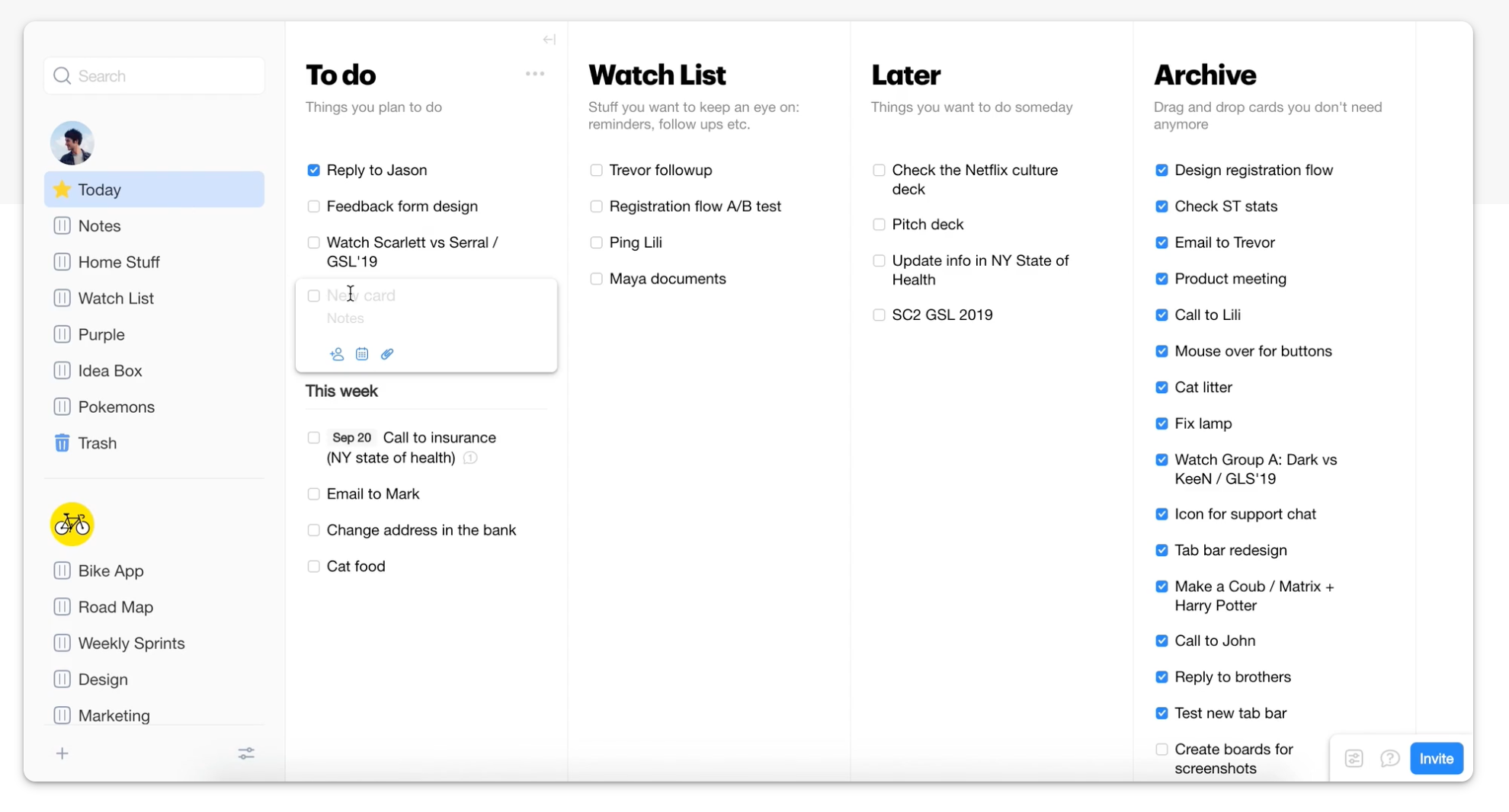
A new crop of what is being called “goal managers” has developed to let users visualize tasks across horizontal columns. Much like Kanban boards, and yet, not quite and simpler.
Kanban boards encourage users to move tasks between columns as the task progresses through stages. But that’s not really the point of a goal manager.
Apps like Timestripe and Columns are excellent examples of this new breed of visual goal managers.

Where they excel is their ability to lay out lists side by side, and to quickly glance across multiple lists at once. However, outside some limited date based filtering, the tasks on these lists can’t be re-visualized across smart lists.
What makes Todoist so powerful is its ability to let users create unlimited smart lists to view tasks with endlessly creative user-defined parameters. And tasks can be shown concurrently in all applicable views.
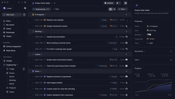
But Todoist remains, essentially, one vertical list. It has not evolved to let users view multiple lists at once. And that’s really where the proverbial task-management puck seems to be skating.
So, on the one hand, we have mainstays, like Todoist, that let users filter and drill down into tasks with custom smart lists, and, on the other, up-and-comers like Timestripe and Columns that let users view multiple lists side by side.
Here’s an idea. Can we combine the best of these two approaches for the ultimate, flexible, customizable visual task manager?
By combining the visual appeal of, say, Columns, with the flexibility of a Todoist, we could get closer to a task manager that allows for more intentional daily task management.
For instance, if I could scan a few lists simultaneously at the start of my day, star the tasks I want to tackle, and then head into a starred view, I wouldn’t end up over-scheduling myself with tasks (something I wrote about here).
Or, if I’m managing a team project, I could run a smart lists that let me see what tasks each of my teammates are assigned to, and check in with them to see how they are progressing.
Or, better yet, use colored flags to assign tasks to an Eisenhower Matrix, and see those tasks laid out as an actual 2×2 matrix.
The point is that the next generation of task managers needs to be more visually flexible, while continuing to let users filter tasks into smart lists that match their unique workflows.
What do you think? Would such a task manager appeal to you? How would steer development of the next generation of task managers? Let me know on Twitter @focus_tools.


